
YouTube’s new look and the potential loss of CBS on YouTube TV
At the end of last year, YouTube rolled out a new design featuring a softer shade of red and a magenta gradient. The design team has now shared more about these changes.
The old red, used since 2017, was too bright and caused issues like appearing orange on some screens and screen burn-in on TVs. To fix this, they chose a cooler shade of red, making it more user-friendly while keeping the vibrant feel. They avoided colors that seemed too business-like or cold, aiming instead for a warm, welcoming vibe.
Additionally, they introduced a red-to-magenta gradient in the video progress bar. They considered other colors but decided magenta was the best match for the new red. Magenta, rare in nature, stands for creativity and growth, which aligns with YouTube’s identity. The gradient is angled at 45 degrees, with magenta on the right, to suggest forward movement.
Red is now sparingly used for “brand marks, identity elements, and key UI moments” to keep its special feel, like in the logo and icons. The gradient appears in places like topic icons, the progress bar, and buttons for likes, subscriptions, premium badges, and live rings.
Motion in the design was also updated. The startup animation now includes the gradient for a stronger brand impact, making the progress bar quicker and thinner for a modern look, and shortening the animation by 0.2 seconds.
Looking forward, YouTube plans to refine aspects like images, icons, text styles, and more colors to keep the app feeling fresh.
On a different note, YouTube TV announced that talks with Paramount have not yet resulted in a new agreement. If no deal is reached, CBS, CBS Sports, and other Paramount channels will disappear from YouTube TV after February 13, 2025, affecting both the Base and Spanish plans, as well as various add-ons.
If this happens, YouTube TV subscribers will lose access to their DVR recordings of these channels. However, YouTube TV is offering an $8 credit to help cover the cost of a Paramount+ subscription at $7.99 a month. Members with certain add-ons will receive further discounts or refunds.
YouTube has expressed its desire to maintain CBS and CBS Sports on their platform without increasing costs for users, but negotiations continue. Paramount is a significant partner, and both companies are hopeful to resolve the situation amicably. These contract disputes are not uncommon, with past examples involving NBC and Disney in 2021, amidst Paramount’s ongoing merger with Skydance Media.


Google is testing a new design for the media controls in Android Auto. In the latest beta version (10.8), the media player gets a fresh look, making it easier to use while driving.
Instead of showing small buttons and album art on the side, the new layout places bigger buttons across the screen. The play/pause, next, and previous track controls are now centered, making them easier to tap. The seek bar also stretches across the bottom of the player, giving users a better view of track progress. Album artwork still shows but in a smaller size, and the background uses a blurred version of the same art, giving it a modern style.
This design update first appeared in Android Auto 11.4 beta and seems to still be in testing. Some users have reported seeing this new layout on their head units with version 11.4 or later. Google might be testing the feature through a server-side switch, so it may not appear for everyone yet, even if they have the beta installed.
While it’s not clear when or if this layout will roll out widely, the changes show that Google is focused on improving the Android Auto experience. Bigger buttons and a cleaner layout can make it safer and more convenient to control music while driving. For now, the update is limited to beta testers, and more changes might still come before the final version.

Google recently added a new full-screen account switcher to Android, but many users feel it’s a step back in terms of speed and design. Before this change, when you tapped your profile picture in apps like Gmail or Google Maps, a small pop-up would let you quickly switch accounts without leaving the screen. Now, this action opens a full-screen page, which takes longer to load and feels less smooth.
The new design is trying to be more consistent with Material You — Google’s modern design style — and matches how account switching works in the Google app and Play Store. However, the added animations and full-page layout seem to slow things down instead of improving the experience. It also forces users to take more steps just to switch accounts.
One positive part is that the switcher now includes a “Manage accounts” option directly within the full-screen view. This used to be hidden in a separate menu, so it’s easier to find now. Still, many people preferred the quicker, simpler pop-up style.
It’s not clear if Google will keep this new full-screen switcher or make changes based on feedback. For now, if you use multiple accounts often on Android, expect the process to take a bit longer than before. While design updates can help unify the look of Android apps, they shouldn’t get in the way of basic tasks like switching accounts.
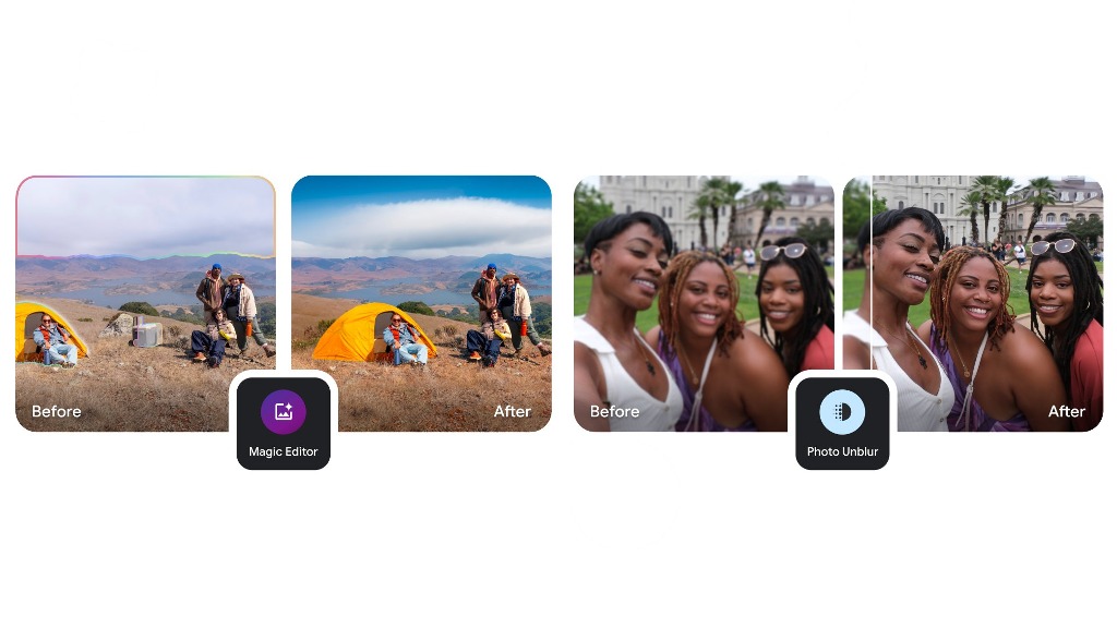
Google is working on a new feature for its Photos app called “Remix,” which could let users create fun, AI-generated versions of their pictures. According to findings from a recent APK teardown of the latest Google Photos update (version 6.79), the new Remix tool may allow users to choose a photo and have the app recreate it in a more creative or playful style using generative AI.
The idea is similar to Google’s existing “Magic Editor,” but Remix looks like it will focus more on reimagining your photos rather than editing them for quality. For example, you might be able to turn a simple photo of a person into a stylized or fantasy-like version using prompts.
The app may show suggestions like “Make it a watercolor painting” or “Turn this into a dream scene,” giving you options to pick from. Users might also get the ability to write their own prompts to customize the output.
The feature isn’t officially available yet, and there’s no confirmed launch date. It’s still under development, and many details could change before it rolls out to users.
In short, Google Remix could be a fun way for people to get creative with their photos, combining AI power with personal memories. We’ll have to wait and see when it officially launches and how it compares to other AI photo tools out there.
-

 Apps1 year ago
Gboard Proofread feature will support selected text
-

 News1 year ago
Samsung USA crafting One UI 6.1.1
-
News1 year ago
Breaking: Samsung Galaxy S22 may get Galaxy AI features
-
 News1 year ago
Samsung Galaxy S23 Ultra with One UI 6.1 and all S24 AI features revealed
-
News1 year ago
One UI 6.1 Auracast (Bluetooth LE Audio) feature coming to many Samsung phones
-

 News1 year ago
Satellite SOS feature coming to Google Pixel phones, evidence leaked
-

 Apps10 months ago
Google Contacts app testing new Besties Widget
-
 Apps12 months ago
Google’s fancy new Weather app is finally available for more Android phones