
Chrome now uses more of your phone’s screen space
For a while, Android has let apps stretch across the full screen, even under the status and navigation bars. However, not every app jumped on board with this feature. With Android 15, Google made a big push, requiring apps to fill the entire screen. This nudged developers to tweak their apps for a full-screen look. Some apps adapted quickly, and now Google Chrome is catching up, too.
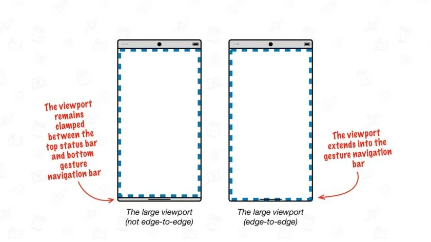
Google recently shared that they’re testing a new Chrome version for Android. This update stretches the browser’s display to the bottom of your phone, even into the area where the navigation bar sits. As seen in a demo image, Chrome’s interface now reaches the screen’s edge, showing webpage content right behind the navigation bar.
This full-screen style is coming with Chrome version 135 for Android, though only a few users have tried it out so far. Google explained that with this setup, Chrome’s bottom bar slides away when you scroll, letting more of the webpage shine through behind the navigation area. This tweak won’t change how developers build their websites, but Google warns that sometimes the navigation bar might slightly cover up parts of the content.
Right now, Google is rolling out this full-screen feature on smaller devices only. They added, “Chrome on Android for bigger screens, like tablets, isn’t included yet—that’s something we’ll work on for a later update.” This change makes browsing feel roomier and more seamless on your phone!


Google Meet is getting a big update to its look, thanks to the new Material 3 design. This change brings a cleaner and more modern style to the video calling app, making it easier and more enjoyable to use.
With Material 3, Google Meet now has rounder buttons, softer colors, and better spacing between elements. The main controls, like the microphone, camera, and end call buttons, are now larger and easier to tap. The icons and text are also clearer, which helps users find what they need quickly during a call.
Another improvement is the new “expressive” color system. This feature lets the app’s colors match your device’s wallpaper or theme, giving each user a unique and personalized experience. The changes also make Google Meet more accessible, as the new design is easier to read and use for everyone, including people with vision difficulties.
These updates are rolling out to both web and mobile versions of Google Meet. Google says the new look will help people feel more comfortable and focused during their meetings. Overall, the Material 3 update makes Google Meet not only look better but also work better for all its users.

Android Auto is a helpful tool that lets you use your phone’s apps safely while driving. It connects your phone to your car’s screen, making it easier to use maps, music, and calls. One of the features many people like is the ability to change how Android Auto looks by switching between light and dark themes.
How to switch between light and dark themes
Android Auto offers two main themes: light and dark. The light theme uses brighter colors, which can make the screen easier to see during the day. The dark theme uses darker colors, which can be more comfortable for your eyes at night or in low light.
To change the theme, follow these steps:
- Open the Android Auto app on your phone.
- Go to the settings menu.
- Find the “Theme” option.
- Choose between “Light,” “Dark,” or “Set by car” (this lets your car decide the theme based on the time of day or your car’s settings).
Why themes matter
Using the right theme can make driving safer and more comfortable. The light theme is good for bright days, while the dark theme helps reduce glare at night. Having these options means you can pick what works best for you, making Android Auto easier to use in any condition.
In short, Android Auto’s theme options are simple to use and help you drive more safely by making the screen easy to see, no matter the time of day.

Google is rolling out some helpful updates to two of its popular apps: Google Drive and Files by Google. These changes are designed to make managing your files and watching videos much smoother.
First, Google Drive is getting a new video player. Now, when you upload a video to Drive and open it, you’ll notice a fresh look that matches Google’s latest design style. The controls, like play and pause, are easier to use and look cleaner. This update makes it simpler to watch videos directly in Drive without needing to download them first.
Meanwhile, the Files by Google app is also getting a makeover. The app is adopting Google’s Material 3 design, which means it looks brighter and more modern. The buttons and menus are easier to see and use, making it simpler to find, move, and organize your files. There are also new color options and improved icons, so everything feels more user-friendly.
Both updates show Google’s commitment to making its apps more helpful and enjoyable to use. Whether you’re watching videos in Drive or sorting files on your phone, these changes aim to save you time and make things less complicated. If you use these apps, keep an eye out for these new features—they should arrive soon!
-

 Apps1 year ago
Gboard Proofread feature will support selected text
-

 News1 year ago
Samsung USA crafting One UI 6.1.1
-

 Apps12 months ago
Google Contacts app testing new Besties Widget
-
 AI12 months ago
Google Pixel 9 Pro may come with a complimentary one-year Gemini Advanced subscription
-
News1 year ago
Breaking: Samsung Galaxy S22 may get Galaxy AI features
-
 Apps12 months ago
Google working on a new video editing feature for its Photo app
-

 Apps12 months ago
Google Maps lets you report traffic jams and accidents on Apple CarPlay, but not on Android Auto
-

 Apps12 months ago
Google Messages app will transform MMS chats into RCS