
Simple scheduling with Google Calendar
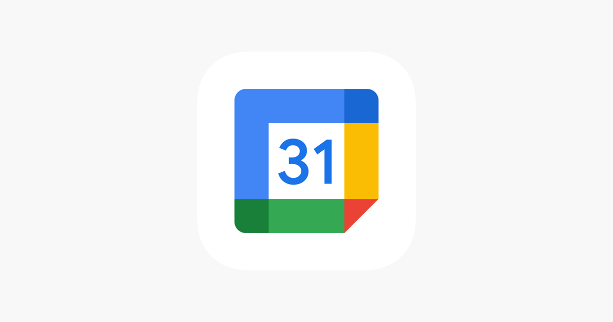
Google Calendar is getting a fresh update that makes planning a breeze. The new design for adding events is straightforward, letting you quickly enter details like the event name, date, and time. With a clean and intuitive layout, setting up meetings or appointments feels effortless, saving you time and keeping things organized.
Editing events is now smoother, too. Changing details such as the time, place, or guest list is easier with clear options and helpful prompts. For shared calendars, you can now see at a glance who has access to an event, which is great for avoiding mix-ups when coordinating with coworkers or family members. This feature shines for group planning.
The update also improves task management. A handy switch lets you choose between adding an event or a task, preventing mix-ups when you’re juggling multiple responsibilities. This makes it simpler to keep track of both your schedule and to-do list in one place.
These upgrades are rolling out to Google Calendar’s mobile apps and website, and most users should notice them soon. The goal is to make scheduling less stressful and more efficient, especially for those with packed days. Google is listening to users and tweaking Calendar to stay a top choice for managing time.


Google Meet is getting a big update to its look, thanks to the new Material 3 design. This change brings a cleaner and more modern style to the video calling app, making it easier and more enjoyable to use.
With Material 3, Google Meet now has rounder buttons, softer colors, and better spacing between elements. The main controls, like the microphone, camera, and end call buttons, are now larger and easier to tap. The icons and text are also clearer, which helps users find what they need quickly during a call.
Another improvement is the new “expressive” color system. This feature lets the app’s colors match your device’s wallpaper or theme, giving each user a unique and personalized experience. The changes also make Google Meet more accessible, as the new design is easier to read and use for everyone, including people with vision difficulties.
These updates are rolling out to both web and mobile versions of Google Meet. Google says the new look will help people feel more comfortable and focused during their meetings. Overall, the Material 3 update makes Google Meet not only look better but also work better for all its users.

Android Auto is a helpful tool that lets you use your phone’s apps safely while driving. It connects your phone to your car’s screen, making it easier to use maps, music, and calls. One of the features many people like is the ability to change how Android Auto looks by switching between light and dark themes.
How to switch between light and dark themes
Android Auto offers two main themes: light and dark. The light theme uses brighter colors, which can make the screen easier to see during the day. The dark theme uses darker colors, which can be more comfortable for your eyes at night or in low light.
To change the theme, follow these steps:
- Open the Android Auto app on your phone.
- Go to the settings menu.
- Find the “Theme” option.
- Choose between “Light,” “Dark,” or “Set by car” (this lets your car decide the theme based on the time of day or your car’s settings).
Why themes matter
Using the right theme can make driving safer and more comfortable. The light theme is good for bright days, while the dark theme helps reduce glare at night. Having these options means you can pick what works best for you, making Android Auto easier to use in any condition.
In short, Android Auto’s theme options are simple to use and help you drive more safely by making the screen easy to see, no matter the time of day.

Google is rolling out some helpful updates to two of its popular apps: Google Drive and Files by Google. These changes are designed to make managing your files and watching videos much smoother.
First, Google Drive is getting a new video player. Now, when you upload a video to Drive and open it, you’ll notice a fresh look that matches Google’s latest design style. The controls, like play and pause, are easier to use and look cleaner. This update makes it simpler to watch videos directly in Drive without needing to download them first.
Meanwhile, the Files by Google app is also getting a makeover. The app is adopting Google’s Material 3 design, which means it looks brighter and more modern. The buttons and menus are easier to see and use, making it simpler to find, move, and organize your files. There are also new color options and improved icons, so everything feels more user-friendly.
Both updates show Google’s commitment to making its apps more helpful and enjoyable to use. Whether you’re watching videos in Drive or sorting files on your phone, these changes aim to save you time and make things less complicated. If you use these apps, keep an eye out for these new features—they should arrive soon!
-

 Apps2 years ago
Gboard Proofread feature will support selected text
-

 Apps2 years ago
Google Contacts app testing new Besties Widget
-
 AI2 years ago
Google Pixel 9 Pro may come with a complimentary one-year Gemini Advanced subscription
-
 Apps2 years ago
Google working on a new video editing feature for its Photo app
-

 Apps2 years ago
Google Maps lets you report traffic jams and accidents on Apple CarPlay, but not on Android Auto
-

 Apps2 years ago
Google Messages app will transform MMS chats into RCS
-

 News2 years ago
Samsung USA crafting One UI 6.1.1
-
 News2 years ago
Google Pixel Watch 2 Vs OnePlus Watch 2: The new champion?