
Fullscreen account switcher on Android feels clunky and slow

Google recently added a new full-screen account switcher to Android, but many users feel it’s a step back in terms of speed and design. Before this change, when you tapped your profile picture in apps like Gmail or Google Maps, a small pop-up would let you quickly switch accounts without leaving the screen. Now, this action opens a full-screen page, which takes longer to load and feels less smooth.
The new design is trying to be more consistent with Material You — Google’s modern design style — and matches how account switching works in the Google app and Play Store. However, the added animations and full-page layout seem to slow things down instead of improving the experience. It also forces users to take more steps just to switch accounts.
One positive part is that the switcher now includes a “Manage accounts” option directly within the full-screen view. This used to be hidden in a separate menu, so it’s easier to find now. Still, many people preferred the quicker, simpler pop-up style.
It’s not clear if Google will keep this new full-screen switcher or make changes based on feedback. For now, if you use multiple accounts often on Android, expect the process to take a bit longer than before. While design updates can help unify the look of Android apps, they shouldn’t get in the way of basic tasks like switching accounts.


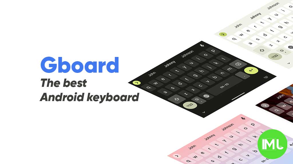
Google is rolling out a new look for the emoji section in Gboard, giving it a cleaner and simpler design. This updated layout is starting to show up for users on the latest Gboard beta version (13.9), and it might soon come to the stable version too.
In the new design, the emoji panel now floats above the keyboard instead of being attached to it. The search bar, category tabs, and the emoji grid all appear inside a neat floating window with rounded corners. This gives the whole emoji section a modern and less cluttered appearance.
The categories at the top are still there, but they now sit in a card-style bar that blends nicely with the rest of the UI. The search bar has also been updated with a clearer background, making it easier to use. Even though the layout looks different, the actual emoji and features like stickers and GIFs are still available and work the same way.
Some users have also noticed that this new style matches the look of other Google apps that follow the updated Material You design. It’s part of Google’s effort to make its apps feel more consistent and user-friendly across Android.
Right now, the redesign seems to be rolling out in stages, so not everyone will see it immediately. If you’re using Gboard beta, you might already have it, or it could show up soon.

Google is testing a new design for the media controls in Android Auto. In the latest beta version (10.8), the media player gets a fresh look, making it easier to use while driving.
Instead of showing small buttons and album art on the side, the new layout places bigger buttons across the screen. The play/pause, next, and previous track controls are now centered, making them easier to tap. The seek bar also stretches across the bottom of the player, giving users a better view of track progress. Album artwork still shows but in a smaller size, and the background uses a blurred version of the same art, giving it a modern style.
This design update first appeared in Android Auto 11.4 beta and seems to still be in testing. Some users have reported seeing this new layout on their head units with version 11.4 or later. Google might be testing the feature through a server-side switch, so it may not appear for everyone yet, even if they have the beta installed.
While it’s not clear when or if this layout will roll out widely, the changes show that Google is focused on improving the Android Auto experience. Bigger buttons and a cleaner layout can make it safer and more convenient to control music while driving. For now, the update is limited to beta testers, and more changes might still come before the final version.
Google is working on a new feature for its Photos app called “Remix,” which could let users create fun, AI-generated versions of their pictures. According to findings from a recent APK teardown of the latest Google Photos update (version 6.79), the new Remix tool may allow users to choose a photo and have the app recreate it in a more creative or playful style using generative AI.
The idea is similar to Google’s existing “Magic Editor,” but Remix looks like it will focus more on reimagining your photos rather than editing them for quality. For example, you might be able to turn a simple photo of a person into a stylized or fantasy-like version using prompts.
The app may show suggestions like “Make it a watercolor painting” or “Turn this into a dream scene,” giving you options to pick from. Users might also get the ability to write their own prompts to customize the output.
The feature isn’t officially available yet, and there’s no confirmed launch date. It’s still under development, and many details could change before it rolls out to users.
In short, Google Remix could be a fun way for people to get creative with their photos, combining AI power with personal memories. We’ll have to wait and see when it officially launches and how it compares to other AI photo tools out there.
-

 Apps1 year ago
Gboard Proofread feature will support selected text
-

 News1 year ago
Samsung USA crafting One UI 6.1.1
-
News1 year ago
Breaking: Samsung Galaxy S22 may get Galaxy AI features
-
 News1 year ago
Samsung Galaxy S23 Ultra with One UI 6.1 and all S24 AI features revealed
-
News1 year ago
One UI 6.1 Auracast (Bluetooth LE Audio) feature coming to many Samsung phones
-

 News1 year ago
Satellite SOS feature coming to Google Pixel phones, evidence leaked
-

 Apps10 months ago
Google Contacts app testing new Besties Widget
-
 Apps12 months ago
Google’s fancy new Weather app is finally available for more Android phones