
News
Google Pixel Watch 2 Vs OnePlus Watch 2: The new champion?
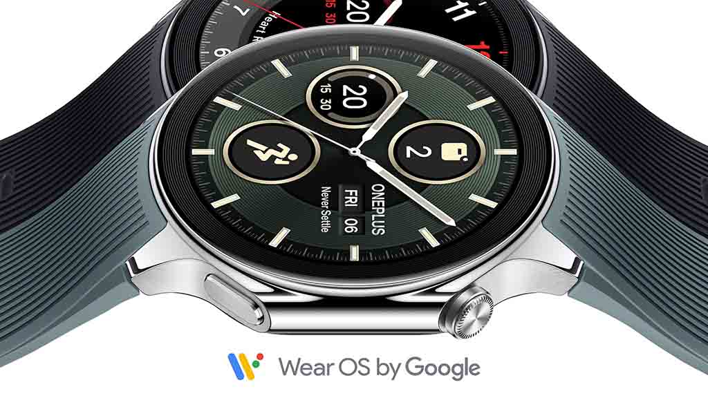
OnePlus Watch 2 officially launched as the second tough rival to Google Pixel Watch 2. While Samsung is a popular choice in the wearable market, the OnePlus Watch 2 surprisingly opted for Wear OS to better compete against Galaxy Watch and Pixel Watch.
Following the OnePlus Watch 2 debut, Android smartwatch buyers now have another reliable option apart from the Samsung Galaxy Watch 6 and Google Pixel Watch 2. Notably, the OnePlus Watch 2 brings a powerful processor, exceptional battery life, and durable design.
Follow us on Facebook | X (Twitter) | Telegram
Similar to One UI Watch, the OnePlus Watch runs RTOS, which is crafted on the Wear OS platform by OnePlus and Google. The Watch 2 also boasts Snapdragon W5 Gen 1 CPU, the same chipset that Google used in its second-generation Pixel Watch.
The all-new flagship #OnePlusWatch2 powered by @WearOSbyGoogle, out now!https://t.co/ogxMyTSrVC pic.twitter.com/nk8eEk5RFI
— OnePlus (@oneplus) February 26, 2024
The biggest advantage that the OnePlus Watch 2 has is its battery life, which is said to hit 100 hours. Thanks to the reliable processor and Wear OS-based hybrid software (which is yet to be tested by the public), OnePlus Watch 2 now dominates the Wear OS market – in terms of battery.
Check the specs comparison below.
| Spec/Feature | Google Pixel Watch 2 | OnePlus Watch 2 |
|---|---|---|
| Display | 1.2-inch (384×384) AMOLED 320ppi, 1,000 nits, 60Hz |
1.43-inch (466×466) AMOLED 326ppi, 1,000 nits, 60Hz |
| Colors | Matte Black, Polished Silver, Champagne Gold | Black Steel, Radiant Steel |
| Battery | 306mAh (24 hours w/ AOD) | 500mAh (100 hours) |
| Weight | 31g without strap | 49g without strap |
| Processor | Snapdragon W5 Gen 1 + Cortex M33 MCU | Snapdragon W5 + BES 2700 MCU |
| Memory | 2GB RAM + 32GB storage | 2GB RAM + 32GB storage |
| Operating System | Wear OS 4 | Wear OS 4 + RTOS |
| Material | Aluminum case, fluoroelastomer band | Stainless steel case and buckle, fluoroelastomer strap |
| Protection | Gorilla Glass 5; 5ATM; IP68 | 5ATM, IP68, MIL-STD-810H, 2.5D sapphire crystal glass |
| Navigation | Touchscreen, inactive crown, side button | Touchscreen, haptic crown, side button |
| Connectivity | LTE (optional), Bluetooth 5.0, Wi-Fi 802.11 b/g/n 2.4GHz, NFC, GPS L1, GLONASS, BeiDou, Galileo, QZSS | Bluetooth, Wi-Fi, NFC, GPS (Dual-frequency L1 + L5), GLONASS, GALILEO, BeiDou, QZSS |
| Charging | Wireless | Pogo pin |
| Sensors | Accelerometer, altimeter, ambient light, cEDA, compass, ECG, gyroscope, magnetometer, optical heart rate, skin temperature, SpO2 | Accelerometer, altimeter, ambient light, compass, gyroscope, HRM, SpO2 |
| Dimensions | 41 x 41 x 12.3mm | 47 x 46.6 x 12.1mm |


Google Meet is getting a big update to its look, thanks to the new Material 3 design. This change brings a cleaner and more modern style to the video calling app, making it easier and more enjoyable to use.
With Material 3, Google Meet now has rounder buttons, softer colors, and better spacing between elements. The main controls, like the microphone, camera, and end call buttons, are now larger and easier to tap. The icons and text are also clearer, which helps users find what they need quickly during a call.
Another improvement is the new “expressive” color system. This feature lets the app’s colors match your device’s wallpaper or theme, giving each user a unique and personalized experience. The changes also make Google Meet more accessible, as the new design is easier to read and use for everyone, including people with vision difficulties.
These updates are rolling out to both web and mobile versions of Google Meet. Google says the new look will help people feel more comfortable and focused during their meetings. Overall, the Material 3 update makes Google Meet not only look better but also work better for all its users.

Android Auto is a helpful tool that lets you use your phone’s apps safely while driving. It connects your phone to your car’s screen, making it easier to use maps, music, and calls. One of the features many people like is the ability to change how Android Auto looks by switching between light and dark themes.
How to switch between light and dark themes
Android Auto offers two main themes: light and dark. The light theme uses brighter colors, which can make the screen easier to see during the day. The dark theme uses darker colors, which can be more comfortable for your eyes at night or in low light.
To change the theme, follow these steps:
- Open the Android Auto app on your phone.
- Go to the settings menu.
- Find the “Theme” option.
- Choose between “Light,” “Dark,” or “Set by car” (this lets your car decide the theme based on the time of day or your car’s settings).
Why themes matter
Using the right theme can make driving safer and more comfortable. The light theme is good for bright days, while the dark theme helps reduce glare at night. Having these options means you can pick what works best for you, making Android Auto easier to use in any condition.
In short, Android Auto’s theme options are simple to use and help you drive more safely by making the screen easy to see, no matter the time of day.

Google is rolling out some helpful updates to two of its popular apps: Google Drive and Files by Google. These changes are designed to make managing your files and watching videos much smoother.
First, Google Drive is getting a new video player. Now, when you upload a video to Drive and open it, you’ll notice a fresh look that matches Google’s latest design style. The controls, like play and pause, are easier to use and look cleaner. This update makes it simpler to watch videos directly in Drive without needing to download them first.
Meanwhile, the Files by Google app is also getting a makeover. The app is adopting Google’s Material 3 design, which means it looks brighter and more modern. The buttons and menus are easier to see and use, making it simpler to find, move, and organize your files. There are also new color options and improved icons, so everything feels more user-friendly.
Both updates show Google’s commitment to making its apps more helpful and enjoyable to use. Whether you’re watching videos in Drive or sorting files on your phone, these changes aim to save you time and make things less complicated. If you use these apps, keep an eye out for these new features—they should arrive soon!
-

 Apps2 years ago
Gboard Proofread feature will support selected text
-

 Apps2 years ago
Google Contacts app testing new Besties Widget
-
 AI2 years ago
Google Pixel 9 Pro may come with a complimentary one-year Gemini Advanced subscription
-
 Apps2 years ago
Google working on a new video editing feature for its Photo app
-

 Apps2 years ago
Google Maps lets you report traffic jams and accidents on Apple CarPlay, but not on Android Auto
-

 Apps2 years ago
Google Messages app will transform MMS chats into RCS
-

 News2 years ago
Samsung USA crafting One UI 6.1.1
-
 AI2 years ago
Gemini now answers questions on your locked Android phone