News
Pixel 9 Pro XL unboxing and durability test: a solid build with new packaging design
Top 3 Key Points:
- New Packaging: The Pixel 9 Pro XL features redesigned packaging, including a unique sleeve and wrap.
- Durability: The Pixel 9 Pro XL is even more durable than its predecessor, surviving harsh scratch and bend tests.
- Design Updates: Notable design changes include a thicker camera bar and improved earpiece and antenna placement.
In anticipation of its upcoming launch, the Pixel 9 Pro XL has already gone through an unboxing and durability test by JerryRigEverything, revealing some key insights about Google’s latest flagship phone.
The unboxing experience of the Pixel 9 Pro XL starts with a fresh new packaging design. Instead of the traditional four-color “G” logo, the box now simply features “Google.” To access the phone, you first peel off two pill-shaped stickers on the back of the packaging, allowing you to slide off the outer sleeve. The box inside has the product name on the side and opens to reveal the phone, which is now covered by a sleeve that wraps around both the front and back. This is a step up from the Pixel 8, where the wrap only protected the display. The USB-C cable comes in slightly flatter packaging, adding to the sleek presentation.
When comparing the size of the new Pixel’s camera bar, it measures about 3.5 mm tall, thicker than a typical house key or about the height of two quarters stacked together. The front of the phone is protected by Gorilla Glass Victus 2, which showed “scratches at a level six with deeper grooves at a level seven” during testing. Above the 42MP front-facing camera, there’s an extremely thin earpiece slit, with a centered plastic antenna line placed just above it.
The durability test put the Pixel 9 Pro XL through its paces, including a razor blade being used to pop off the power button and volume rocker. While they could be reinserted, the aluminum rails did show scratches, demonstrating an extreme example of potential damage. The ultrasonic fingerprint sensor was also tested and managed to function even after enduring “copious amounts of level seven deeper grooves.”
A common mistake made by users is inserting the SIM ejection tool into the microphone hole next to the USB-C port, rather than the correct slot further away from the connector. This is something to watch out for when handling the device.
Perhaps the most impressive aspect of the test was the bend test. The Pixel 9 Pro XL proved to be even more robust than its predecessor, showing no creaky sounds or noticeable flexing, either from the front or back. This is a significant improvement over the Pixel 7 Pro, which developed a gap in the frame after bending. Google has claimed that the Pixel 9 series is “twice as durable as the Pixel 8,” and the test results seem to support this claim.
Overall, the Pixel 9 Pro XL not only introduces a fresh packaging design but also demonstrates significant durability improvements, making it one of the most solidly built devices Google has released to date.
Google Meet gets a fresh new look with Material 3 design
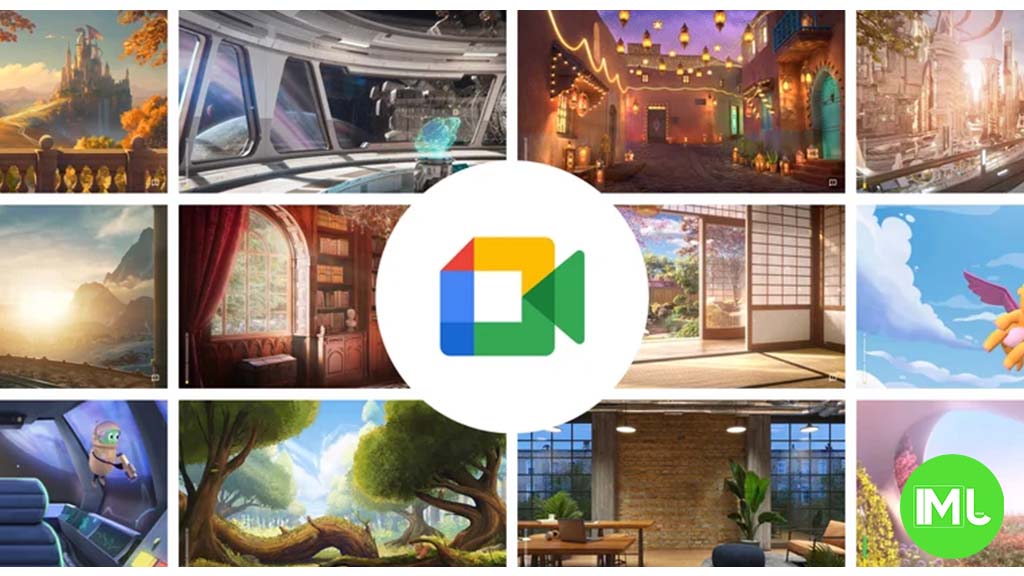
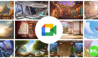
Google Meet is getting a big update to its look, thanks to the new Material 3 design. This change brings a cleaner and more modern style to the video calling app, making it easier and more enjoyable to use.
With Material 3, Google Meet now has rounder buttons, softer colors, and better spacing between elements. The main controls, like the microphone, camera, and end call buttons, are now larger and easier to tap. The icons and text are also clearer, which helps users find what they need quickly during a call.
Another improvement is the new “expressive” color system. This feature lets the app’s colors match your device’s wallpaper or theme, giving each user a unique and personalized experience. The changes also make Google Meet more accessible, as the new design is easier to read and use for everyone, including people with vision difficulties.
These updates are rolling out to both web and mobile versions of Google Meet. Google says the new look will help people feel more comfortable and focused during their meetings. Overall, the Material 3 update makes Google Meet not only look better but also work better for all its users.
Android
Easy ways to change Android Auto’s look with light and dark themes
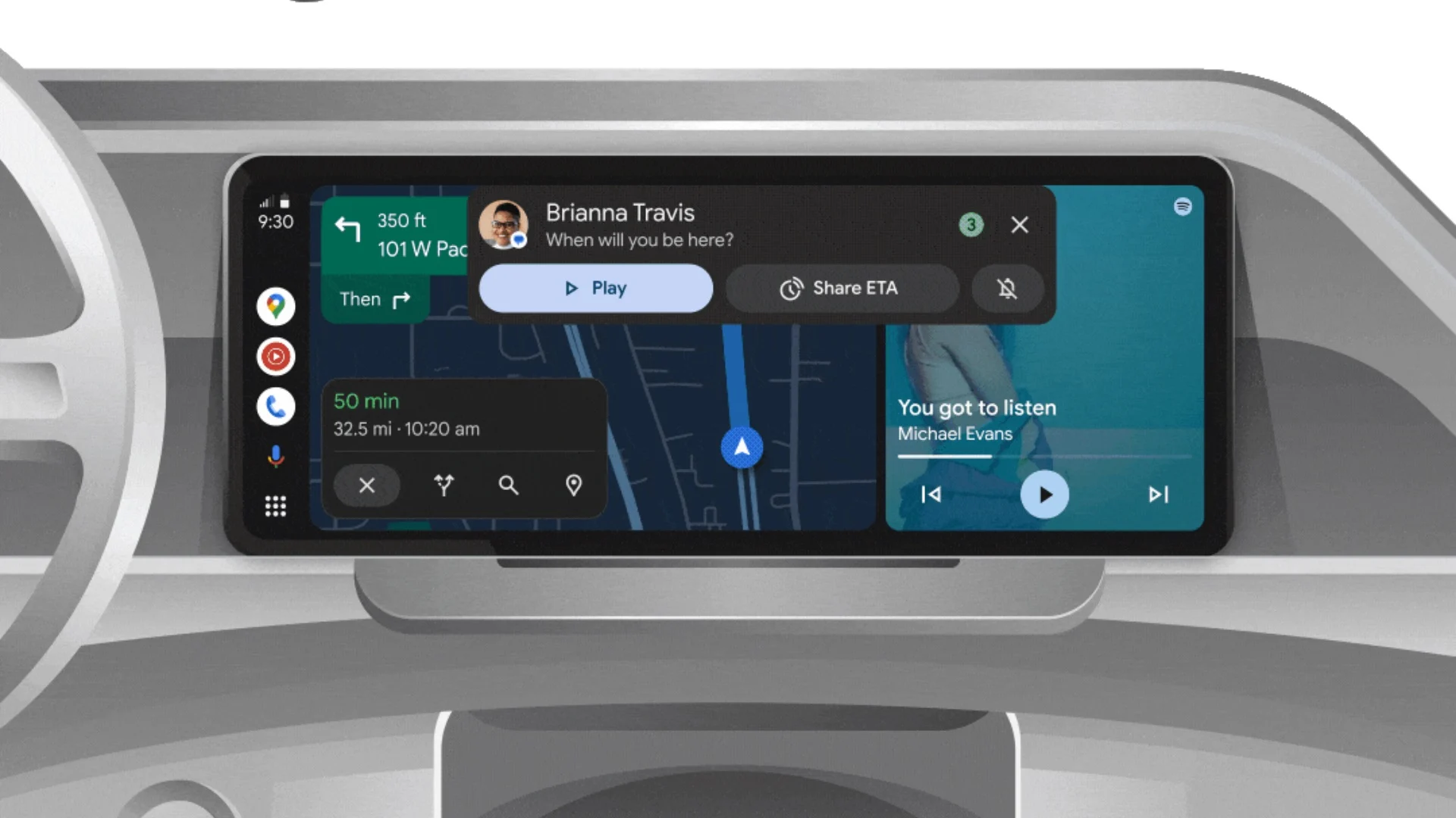
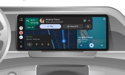
Android Auto is a helpful tool that lets you use your phone’s apps safely while driving. It connects your phone to your car’s screen, making it easier to use maps, music, and calls. One of the features many people like is the ability to change how Android Auto looks by switching between light and dark themes.
How to switch between light and dark themes
Android Auto offers two main themes: light and dark. The light theme uses brighter colors, which can make the screen easier to see during the day. The dark theme uses darker colors, which can be more comfortable for your eyes at night or in low light.
To change the theme, follow these steps:
- Open the Android Auto app on your phone.
- Go to the settings menu.
- Find the “Theme” option.
- Choose between “Light,” “Dark,” or “Set by car” (this lets your car decide the theme based on the time of day or your car’s settings).
Why themes matter
Using the right theme can make driving safer and more comfortable. The light theme is good for bright days, while the dark theme helps reduce glare at night. Having these options means you can pick what works best for you, making Android Auto easier to use in any condition.
In short, Android Auto’s theme options are simple to use and help you drive more safely by making the screen easy to see, no matter the time of day.
Google Drive and Files by Google get fresh updates for easier use
Google is rolling out some helpful updates to two of its popular apps: Google Drive and Files by Google. These changes are designed to make managing your files and watching videos much smoother.
First, Google Drive is getting a new video player. Now, when you upload a video to Drive and open it, you’ll notice a fresh look that matches Google’s latest design style. The controls, like play and pause, are easier to use and look cleaner. This update makes it simpler to watch videos directly in Drive without needing to download them first.
Meanwhile, the Files by Google app is also getting a makeover. The app is adopting Google’s Material 3 design, which means it looks brighter and more modern. The buttons and menus are easier to see and use, making it simpler to find, move, and organize your files. There are also new color options and improved icons, so everything feels more user-friendly.
Both updates show Google’s commitment to making its apps more helpful and enjoyable to use. Whether you’re watching videos in Drive or sorting files on your phone, these changes aim to save you time and make things less complicated. If you use these apps, keep an eye out for these new features—they should arrive soon!
-
 Apps1 year ago
Gboard Proofread feature will support selected text
-
 News1 year ago
Samsung USA crafting One UI 6.1.1
-

 Apps1 year ago
Google Contacts app testing new Besties Widget
-
 AI12 months ago
Google Pixel 9 Pro may come with a complimentary one-year Gemini Advanced subscription
-
 Apps12 months ago
Google working on a new video editing feature for its Photo app
-
 Apps12 months ago
Google Maps lets you report traffic jams and accidents on Apple CarPlay, but not on Android Auto
-
 Apps1 year ago
Google Messages app will transform MMS chats into RCS
-

 News1 year ago
Breaking: Samsung Galaxy S22 may get Galaxy AI features

