Pixel Buds app visible in Pixel Launcher after update and Google TV moves away from full-width search bar
Top 3 Key Points:
- The Pixel Buds app now appears in Pixel Launcher after the latest update.
- Google TV redesign replaces the full-width search bar with a more compact magnifying glass icon.
- The redesign of Google TV enhances the user experience by offering a more immersive interface.
Google has made a significant update to its Pixel phones by allowing the Pixel Buds app to now appear in the Pixel Launcher, a feature that was previously hidden. With the new version 1.0.673625792 of the Pixel Buds app, which also supports the upcoming Pixel Buds Pro 2, the app can be displayed directly in the launcher when your Pixel Buds are paired or saved to the device.
This change allows users to place the Pixel Buds app on their home screens for quick access to settings, instead of using a widget or shortcut that shows a live image of the headphones. While some found the previous shortcut, which displayed a small icon of the headphones in the corner, out of place on their home screens, this new option simplifies access. Some users might still prefer using the Battery widget or the Bluetooth Quick Settings Tile for even faster access.
It’s important to note that this app icon was always visible on other Android devices, but only Pixel phones had it hidden. The updated version of the Pixel Buds app is now available through the Play Store for all users.
Meanwhile, Google TV’s Android app is undergoing a redesign to streamline its interface, moving away from the large, full-width search bar at the top. Previously, this bar featured “Google TV” branding, a voice search shortcut, and a user account switcher. The redesign replaces the large bar with a smaller magnifying glass icon next to the user’s profile avatar, while the “Google TV” logo shifts to the top-left corner of the screen.
This new layout allows artwork to extend to the top of the screen, creating a more immersive experience for users. When you initiate a search, you’ll now find an “Explore genres” grid, featuring categories like Action, Comedy, and Animated content. This leads to dedicated pages with more viewing options, a feature that wasn’t part of the previous design.
Many of Google’s apps, such as Google Messages and the Play Store, have been adopting similar minimalistic designs by removing large search bars in favor of smaller icons. While the full-width bar makes it easier to find and access search features, the compact magnifying glass icon saves space and looks more modern.
The Google TV redesign is currently rolling out via server-side updates, but it’s not yet widely available. Some devices, including the Pixel Fold, are already showing these changes with version 4.39.2486.x of the app.
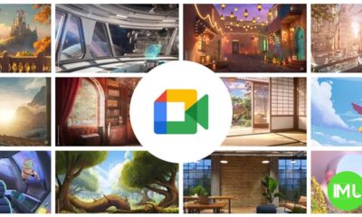
Google Meet gets a fresh new look with Material 3 design
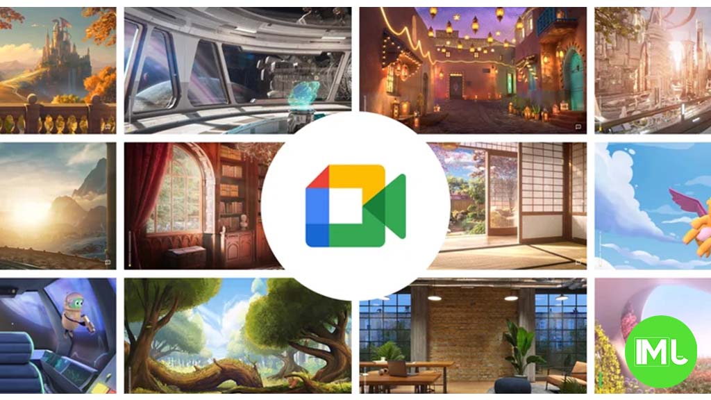
Google Meet is getting a big update to its look, thanks to the new Material 3 design. This change brings a cleaner and more modern style to the video calling app, making it easier and more enjoyable to use.
With Material 3, Google Meet now has rounder buttons, softer colors, and better spacing between elements. The main controls, like the microphone, camera, and end call buttons, are now larger and easier to tap. The icons and text are also clearer, which helps users find what they need quickly during a call.
Another improvement is the new “expressive” color system. This feature lets the app’s colors match your device’s wallpaper or theme, giving each user a unique and personalized experience. The changes also make Google Meet more accessible, as the new design is easier to read and use for everyone, including people with vision difficulties.
These updates are rolling out to both web and mobile versions of Google Meet. Google says the new look will help people feel more comfortable and focused during their meetings. Overall, the Material 3 update makes Google Meet not only look better but also work better for all its users.
Android
Easy ways to change Android Auto’s look with light and dark themes
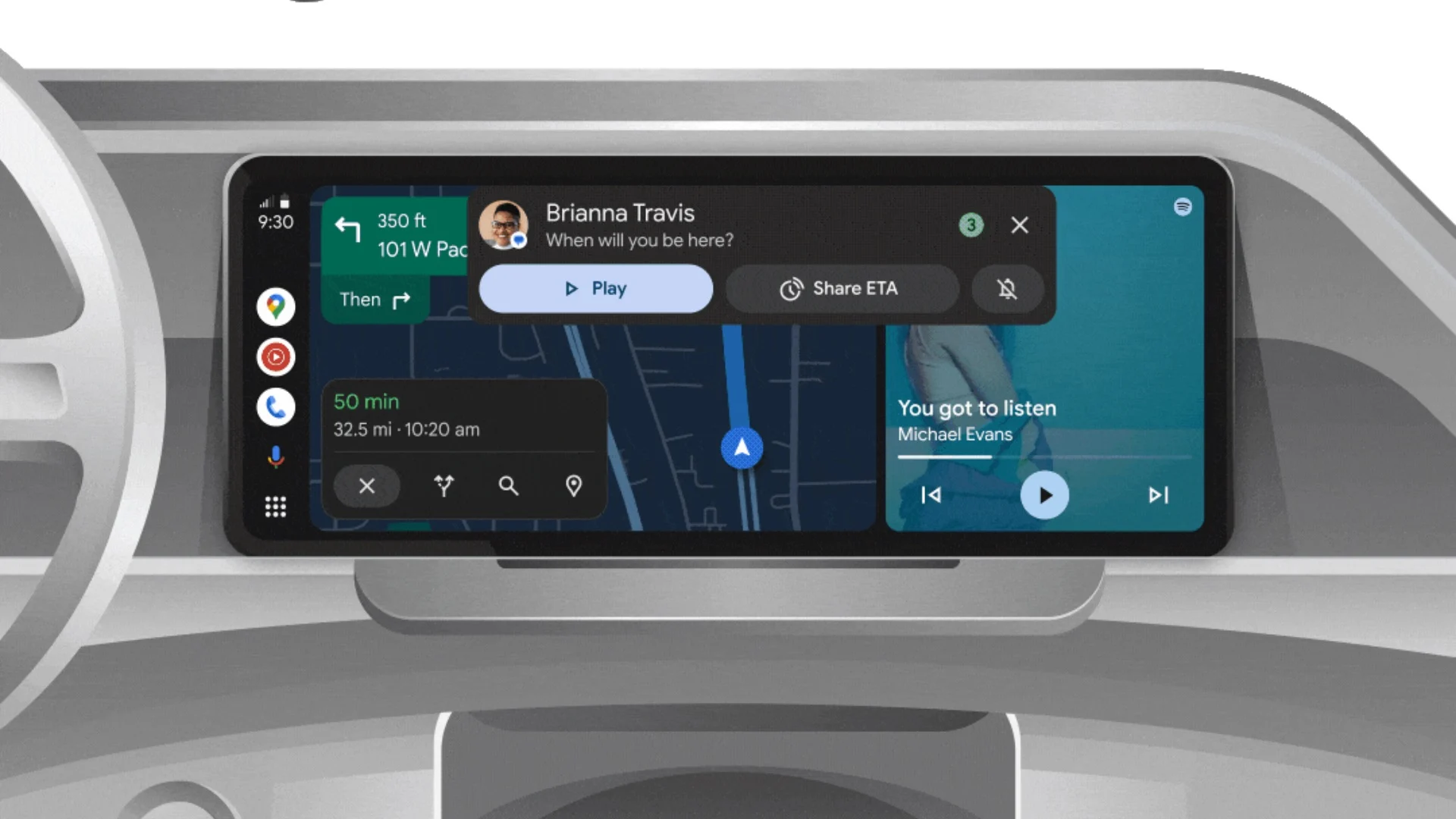
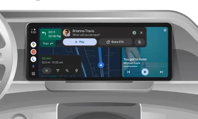
Android Auto is a helpful tool that lets you use your phone’s apps safely while driving. It connects your phone to your car’s screen, making it easier to use maps, music, and calls. One of the features many people like is the ability to change how Android Auto looks by switching between light and dark themes.
How to switch between light and dark themes
Android Auto offers two main themes: light and dark. The light theme uses brighter colors, which can make the screen easier to see during the day. The dark theme uses darker colors, which can be more comfortable for your eyes at night or in low light.
To change the theme, follow these steps:
- Open the Android Auto app on your phone.
- Go to the settings menu.
- Find the “Theme” option.
- Choose between “Light,” “Dark,” or “Set by car” (this lets your car decide the theme based on the time of day or your car’s settings).
Why themes matter
Using the right theme can make driving safer and more comfortable. The light theme is good for bright days, while the dark theme helps reduce glare at night. Having these options means you can pick what works best for you, making Android Auto easier to use in any condition.
In short, Android Auto’s theme options are simple to use and help you drive more safely by making the screen easy to see, no matter the time of day.
Google Drive and Files by Google get fresh updates for easier use
Google is rolling out some helpful updates to two of its popular apps: Google Drive and Files by Google. These changes are designed to make managing your files and watching videos much smoother.
First, Google Drive is getting a new video player. Now, when you upload a video to Drive and open it, you’ll notice a fresh look that matches Google’s latest design style. The controls, like play and pause, are easier to use and look cleaner. This update makes it simpler to watch videos directly in Drive without needing to download them first.
Meanwhile, the Files by Google app is also getting a makeover. The app is adopting Google’s Material 3 design, which means it looks brighter and more modern. The buttons and menus are easier to see and use, making it simpler to find, move, and organize your files. There are also new color options and improved icons, so everything feels more user-friendly.
Both updates show Google’s commitment to making its apps more helpful and enjoyable to use. Whether you’re watching videos in Drive or sorting files on your phone, these changes aim to save you time and make things less complicated. If you use these apps, keep an eye out for these new features—they should arrive soon!
-
 Apps1 year ago
Gboard Proofread feature will support selected text
-
 News1 year ago
Samsung USA crafting One UI 6.1.1
-
 Apps12 months ago
Google Contacts app testing new Besties Widget
-
 AI12 months ago
Google Pixel 9 Pro may come with a complimentary one-year Gemini Advanced subscription
-

 News1 year ago
Breaking: Samsung Galaxy S22 may get Galaxy AI features
-
 Apps12 months ago
Google working on a new video editing feature for its Photo app
-
 Apps12 months ago
Google Maps lets you report traffic jams and accidents on Apple CarPlay, but not on Android Auto
-
 Apps12 months ago
Google Messages app will transform MMS chats into RCS

