
Google Photos adds AI-edit labels for transparent image information
In response to the growing impact of generative AI on image editing, Google is introducing a new feature in Google Photos to identify AI-edited images. This update aims to increase transparency around AI-powered changes, making it easier for users to know which images have been digitally enhanced or altered using AI tools.
How AI-Edited Images Are Labeled in Google Photos
With this update, a new “AI info” section will appear in the “Details” view when you swipe up an image in Google Photos. This section will identify edits made with AI when certain metadata is present. The new labels are designed to display on images edited through AI in Google’s tools, such as Google Photos on Android, iOS, and the web.
When an AI edit is detected, users will see phrases like:
- “Edited with Google AI” or “Made by Google AI” in the “Credit” field.
- “Digital source type” offers further specifics:
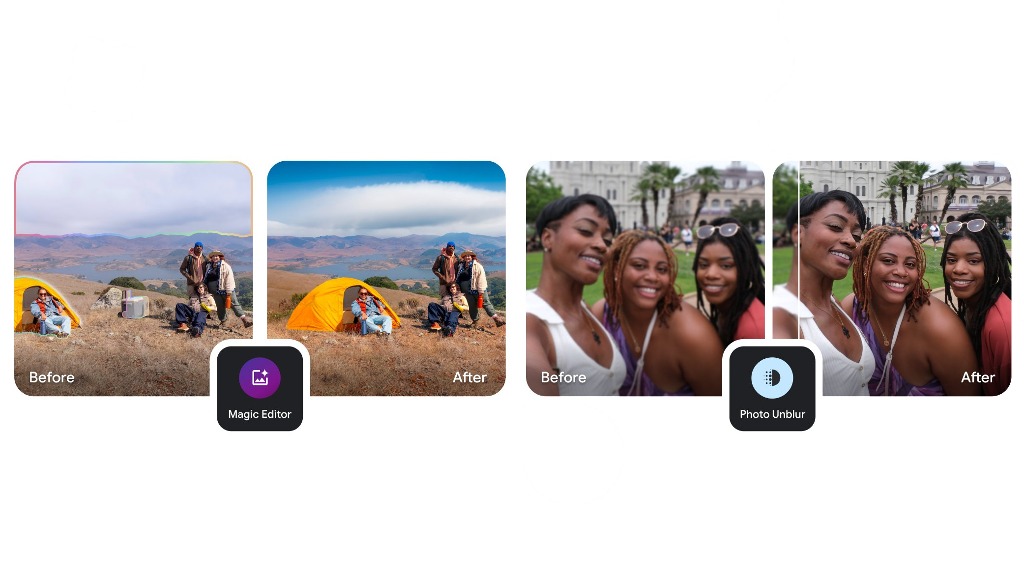
- Edited using Generative AI: This applies to popular tools like Magic Editor, Magic Eraser, and Zoom Enhance, which allow users to quickly remove objects, improve lighting, or adjust image composition. While Zoom Enhance is exclusive to Google’s Pixel phones, the Magic tools are accessible to all users on Android and iOS.
- Composite of captured elements: Features like “Best Take” and “Add Me” are also identified, although they don’t use generative AI and are exclusive to Pixel devices. These tools create a new composition using captured elements rather than a real, single-shot moment.
Supporting Industry Standards and Compatibility
Google’s labeling method aligns with international metadata standards set by the International Press Telecommunications Council (IPTC). This adherence ensures that even images edited with third-party software following IPTC standards will also display the new AI information, as long as they include the required “Credit” and “Digital Source Type” fields.
Rollout and Broader Transparency Goals
Starting next week, the AI-edit labeling will begin rolling out to Google Photos users across all supported platforms. Google has highlighted the importance of responsible AI use and noted that it aims to bring transparency by joining the Coalition for Content Provenance and Authenticity (C2PA), a group focused on content authenticity.
By introducing this labeling, Google emphasizes how generative AI is making tasks like object removal, lighting adjustments, and composition changes simpler and quicker, tasks that once required extensive editing skills. Google aims to provide users with more transparent information, enabling them to identify AI alterations easily.
As AI continues to evolve, Google intends to expand transparency measures around digital edits, with this initial step marking a new phase in AI-powered photography tools.


Google Meet is getting a big update to its look, thanks to the new Material 3 design. This change brings a cleaner and more modern style to the video calling app, making it easier and more enjoyable to use.
With Material 3, Google Meet now has rounder buttons, softer colors, and better spacing between elements. The main controls, like the microphone, camera, and end call buttons, are now larger and easier to tap. The icons and text are also clearer, which helps users find what they need quickly during a call.
Another improvement is the new “expressive” color system. This feature lets the app’s colors match your device’s wallpaper or theme, giving each user a unique and personalized experience. The changes also make Google Meet more accessible, as the new design is easier to read and use for everyone, including people with vision difficulties.
These updates are rolling out to both web and mobile versions of Google Meet. Google says the new look will help people feel more comfortable and focused during their meetings. Overall, the Material 3 update makes Google Meet not only look better but also work better for all its users.

Android Auto is a helpful tool that lets you use your phone’s apps safely while driving. It connects your phone to your car’s screen, making it easier to use maps, music, and calls. One of the features many people like is the ability to change how Android Auto looks by switching between light and dark themes.
How to switch between light and dark themes
Android Auto offers two main themes: light and dark. The light theme uses brighter colors, which can make the screen easier to see during the day. The dark theme uses darker colors, which can be more comfortable for your eyes at night or in low light.
To change the theme, follow these steps:
- Open the Android Auto app on your phone.
- Go to the settings menu.
- Find the “Theme” option.
- Choose between “Light,” “Dark,” or “Set by car” (this lets your car decide the theme based on the time of day or your car’s settings).
Why themes matter
Using the right theme can make driving safer and more comfortable. The light theme is good for bright days, while the dark theme helps reduce glare at night. Having these options means you can pick what works best for you, making Android Auto easier to use in any condition.
In short, Android Auto’s theme options are simple to use and help you drive more safely by making the screen easy to see, no matter the time of day.

Google is rolling out some helpful updates to two of its popular apps: Google Drive and Files by Google. These changes are designed to make managing your files and watching videos much smoother.
First, Google Drive is getting a new video player. Now, when you upload a video to Drive and open it, you’ll notice a fresh look that matches Google’s latest design style. The controls, like play and pause, are easier to use and look cleaner. This update makes it simpler to watch videos directly in Drive without needing to download them first.
Meanwhile, the Files by Google app is also getting a makeover. The app is adopting Google’s Material 3 design, which means it looks brighter and more modern. The buttons and menus are easier to see and use, making it simpler to find, move, and organize your files. There are also new color options and improved icons, so everything feels more user-friendly.
Both updates show Google’s commitment to making its apps more helpful and enjoyable to use. Whether you’re watching videos in Drive or sorting files on your phone, these changes aim to save you time and make things less complicated. If you use these apps, keep an eye out for these new features—they should arrive soon!
-

 Apps2 years ago
Gboard Proofread feature will support selected text
-

 Apps2 years ago
Google Contacts app testing new Besties Widget
-
 AI2 years ago
Google Pixel 9 Pro may come with a complimentary one-year Gemini Advanced subscription
-
 Apps2 years ago
Google working on a new video editing feature for its Photo app
-

 Apps2 years ago
Google Maps lets you report traffic jams and accidents on Apple CarPlay, but not on Android Auto
-

 Apps2 years ago
Google Messages app will transform MMS chats into RCS
-

 News2 years ago
Samsung USA crafting One UI 6.1.1
-

 News2 years ago
Google Pixel Watch 2 Vs OnePlus Watch 2: The new champion?