
Android
Chromecast remote’s volume buttons get it right, while Google TV streamer feels like a downgrade, plus Quick Share on Android adds transfer progress

Google’s new Google TV Streamer has some noticeable improvements, but its remote design—especially the placement of the volume buttons—feels like a step back. Many users, myself included, feel that the original Chromecast remote handled volume control more effectively.
The first Chromecast with Google TV introduced a remote that was simple yet functional. It featured eight buttons, a navigation pad on the front, and two volume buttons conveniently placed on the side. This side-button design, although polarizing, received praise from users who liked its ergonomic feel and ease of use. Others, however, thought volume buttons should be more visible on the top of the remote.
After trying out the Google TV Streamer in my main entertainment spaces, I realized just how functional the side volume buttons were on the Chromecast remote. The Chromecast’s remote, with its rounded base, allowed for a steady grip when adjusting volume, even if the remote wasn’t lifted entirely off the surface. On the Google TV Streamer’s remote, however, the volume buttons have been moved to the top, making it less stable. When adjusting the volume, this design makes the remote wobble, requiring you to pick it up fully each time. Though the new remote includes some helpful upgrades like a dedicated shortcut button, this design change detracts from its overall usability.
Overall, I feel Google made the wrong call by changing the volume button placement. I’d love to know if others prefer the new design or miss the side-mounted volume controls from the original Chromecast remote.
In other news, Android’s file-sharing feature, Quick Share (previously known as “Nearby Share”), now provides a more transparent view of transfer progress. Previously, the sender could see the exact percentage of file transfer completion, but the receiver only had a progress ring. Now, Quick Share shows the transfer percentage directly on the recipient’s device screen, offering clearer feedback on how much longer the transfer might take. This update is now widely available across various devices, including Google Pixel and Samsung Galaxy models.
While small files may transfer too quickly for you to notice the percentage, it’s especially useful for larger files, like videos, where knowing the progress can save you time and provide better insight. This update might seem minor, but it’s a helpful addition that makes Android’s sharing experience just a bit more user-friendly.


Android Auto is a helpful tool that lets you use your phone’s apps safely while driving. It connects your phone to your car’s screen, making it easier to use maps, music, and calls. One of the features many people like is the ability to change how Android Auto looks by switching between light and dark themes.
How to switch between light and dark themes
Android Auto offers two main themes: light and dark. The light theme uses brighter colors, which can make the screen easier to see during the day. The dark theme uses darker colors, which can be more comfortable for your eyes at night or in low light.
To change the theme, follow these steps:
- Open the Android Auto app on your phone.
- Go to the settings menu.
- Find the “Theme” option.
- Choose between “Light,” “Dark,” or “Set by car” (this lets your car decide the theme based on the time of day or your car’s settings).
Why themes matter
Using the right theme can make driving safer and more comfortable. The light theme is good for bright days, while the dark theme helps reduce glare at night. Having these options means you can pick what works best for you, making Android Auto easier to use in any condition.
In short, Android Auto’s theme options are simple to use and help you drive more safely by making the screen easy to see, no matter the time of day.

Google has just rolled out some exciting updates across its services and apps. Here’s a simple breakdown of what’s new and what it means for you.
Gemini 2.5 Pro is here
Google has launched Gemini 2.5 Pro, the latest version of its AI model. This upgrade brings smarter and faster responses, making it easier for users to get helpful answers. Gemini 2.5 Pro is now available in Google’s AI Studio and Vertex AI, so developers can build even better tools and apps using this technology.
Android 16 brings more customization
Android 16 is adding new ways to personalize your phone. One of the standout features is the ability to hide the clock on your lock screen, giving you a cleaner look if you want it. This is part of Google’s push to let users make their phones feel more unique. There’s also a new animation for the power button, making the experience smoother and more modern when you turn your phone on or off.
Google Messages removes the unsubscribe button
If you use Google Messages, you might notice that the “Unsubscribe” button is gone from some business messages. Google has removed this feature, so users now have to find other ways to stop unwanted texts. This change might make it a bit harder to manage spam, but Google hasn’t said why the option was removed.
What does this mean for you
These updates show that Google is focused on making its products smarter and more personal. Whether you’re using AI tools, customizing your phone, or managing your messages, you’ll see some changes that aim to improve your experience.
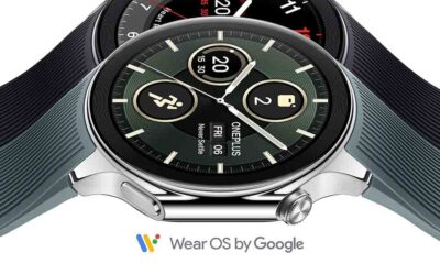
Google Keep is getting a fresh look with the new Material You design, making it more colorful and easier to use on Wear OS smartwatches. The update brings bigger buttons and clearer text, so you can quickly jot down notes or check your lists right from your wrist. This makes Google Keep more handy when you’re on the go and don’t want to pull out your phone.
On another front, Android Automotive is improving how apps show information while you drive. Instead of opening full apps, you’ll see simple cards on your car’s screen that give you important details at a glance.
These cards help keep your focus on the road by showing things like music controls, navigation updates, or reminders without distractions. This new card system is designed to work smoothly with apps like media players and navigation tools, making your driving experience safer and more convenient.
Together, these updates show Google’s effort to make its apps smarter and easier to use in everyday life, whether you’re walking around with your smartwatch or driving your car. The focus is on clear, simple designs that help you get things done quickly without hassle.
In short, Google Keep’s new look on Wear OS and the smart cards in Android Automotive are small but useful changes that make tech fit better into your daily routine.
-

 Apps2 years ago
Gboard Proofread feature will support selected text
-

 Apps2 years ago
Google Contacts app testing new Besties Widget
-
 AI2 years ago
Google Pixel 9 Pro may come with a complimentary one-year Gemini Advanced subscription
-
 Apps2 years ago
Google working on a new video editing feature for its Photo app
-

 Apps2 years ago
Google Maps lets you report traffic jams and accidents on Apple CarPlay, but not on Android Auto
-

 Apps2 years ago
Google Messages app will transform MMS chats into RCS
-

 News2 years ago
Samsung USA crafting One UI 6.1.1
-
 News2 years ago
Google Pixel Watch 2 Vs OnePlus Watch 2: The new champion?