
Android
A fresh look for Music in Android Auto

Android Auto has become an indispensable co-pilot for drivers navigating the digital age. Seamlessly integrating smartphone functionality into the car’s dashboard, prioritizes safety and convenience. In recent weeks, Google has been steadily enhancing the platform, and a significant update has just arrived for music lovers: a redesigned music player interface. This isn’t just a cosmetic tweak; it’s a thoughtful evolution aimed at improving usability and minimizing distractions on the road.
The core principle behind Android Auto is simple: keep the driver’s eyes on the road. This means intuitive controls and consistent design across applications are paramount. Imagine fumbling for the pause button while navigating a busy intersection – a recipe for disaster. Android Auto strives for a unified user experience to mitigate this risk, especially within critical functions like music playback.
A Harmonious Shift: The Evolution of the Music Player
The last major overhaul of Android Auto’s music player interface occurred in 2023, and while functional, it was due for a refresh. The latest update (v13.4), infused with the dynamic color palette of Material You, brings a welcome change, enhancing aesthetics and practicality.1
The most noticeable change is the repositioning of the album art. Now residing on the left side of the display, it provides a clear visual anchor. To the right, information is presented in a logical, easy-to-digest format: the song title, artist name, track duration, and progress bar neatly aligned. This arrangement allows for glances, providing essential information without demanding prolonged attention.
Google’s design team has also subtly adjusted the font sizes. While maintaining readability, they’ve optimized the layout to accommodate all necessary information within a compact space. This is crucial for various screen sizes and resolutions found in different car models.
Below this informational panel, the familiar playback controls – play/pause, skip forward/backward – are prominently displayed. Their size and placement are carefully considered for easy access, even with a quick tap. The goal is to allow drivers to control their music without having to take their eyes off the road for more than a fraction of a second.
Consistency is Key: A Unified Experience Across Apps
One of the strengths of Android Auto’s music integration is its consistency across various music streaming services. Whether you’re a Spotify devotee, an Apple Music subscriber, or a YouTube Music enthusiast, the core playback interface remains largely the same. This means that once you’re familiar with the layout in one app, you can seamlessly navigate others, minimizing the learning curve and maximizing safety.
While the fundamental design remains consistent, minor variations may occur depending on the specific app, the size of the car’s display, and its DPI (dots per inch) settings. However, these variations are subtle, ensuring a cohesive user experience regardless of the setup.
A Closer Look: Visualizing the Changes
(Imagine an embedded image here, similar to the 9to5Google screenshot mentioned in the original article. This would show the new UI in action, ideally with a popular music app like Spotify.)
This visual representation highlights the key changes: the album art on the left, the clear text arrangement on the right, and the readily accessible playback controls below. It showcases the clean, uncluttered design that prioritizes usability.
Beyond Aesthetics: A Focus on Driver Safety
This redesign isn’t merely about making things look prettier; it’s about enhancing the driving experience by minimizing distractions. By streamlining the music player interface, Android Auto empowers drivers to control their audio entertainment safely and efficiently. This commitment to driver safety is at the heart of every design decision, and this latest update is a testament to that philosophy.
The rollout of this new design is already underway as part of the Android Auto v13.4 update. So, the next time you connect your phone to your car, you’ll be greeted with a fresh, more intuitive way to enjoy your favorite tunes on the road. This evolution of Android Auto’s music player is a welcome step forward, proving that even small changes can make a big difference in the driving experience.









Android Auto is a helpful tool that lets you use your phone’s apps safely while driving. It connects your phone to your car’s screen, making it easier to use maps, music, and calls. One of the features many people like is the ability to change how Android Auto looks by switching between light and dark themes.
How to switch between light and dark themes
Android Auto offers two main themes: light and dark. The light theme uses brighter colors, which can make the screen easier to see during the day. The dark theme uses darker colors, which can be more comfortable for your eyes at night or in low light.
To change the theme, follow these steps:
- Open the Android Auto app on your phone.
- Go to the settings menu.
- Find the “Theme” option.
- Choose between “Light,” “Dark,” or “Set by car” (this lets your car decide the theme based on the time of day or your car’s settings).
Why themes matter
Using the right theme can make driving safer and more comfortable. The light theme is good for bright days, while the dark theme helps reduce glare at night. Having these options means you can pick what works best for you, making Android Auto easier to use in any condition.
In short, Android Auto’s theme options are simple to use and help you drive more safely by making the screen easy to see, no matter the time of day.

Google has just rolled out some exciting updates across its services and apps. Here’s a simple breakdown of what’s new and what it means for you.
Gemini 2.5 Pro is here
Google has launched Gemini 2.5 Pro, the latest version of its AI model. This upgrade brings smarter and faster responses, making it easier for users to get helpful answers. Gemini 2.5 Pro is now available in Google’s AI Studio and Vertex AI, so developers can build even better tools and apps using this technology.
Android 16 brings more customization
Android 16 is adding new ways to personalize your phone. One of the standout features is the ability to hide the clock on your lock screen, giving you a cleaner look if you want it. This is part of Google’s push to let users make their phones feel more unique. There’s also a new animation for the power button, making the experience smoother and more modern when you turn your phone on or off.
Google Messages removes the unsubscribe button
If you use Google Messages, you might notice that the “Unsubscribe” button is gone from some business messages. Google has removed this feature, so users now have to find other ways to stop unwanted texts. This change might make it a bit harder to manage spam, but Google hasn’t said why the option was removed.
What does this mean for you
These updates show that Google is focused on making its products smarter and more personal. Whether you’re using AI tools, customizing your phone, or managing your messages, you’ll see some changes that aim to improve your experience.
Google Keep is getting a fresh look with the new Material You design, making it more colorful and easier to use on Wear OS smartwatches. The update brings bigger buttons and clearer text, so you can quickly jot down notes or check your lists right from your wrist. This makes Google Keep more handy when you’re on the go and don’t want to pull out your phone.
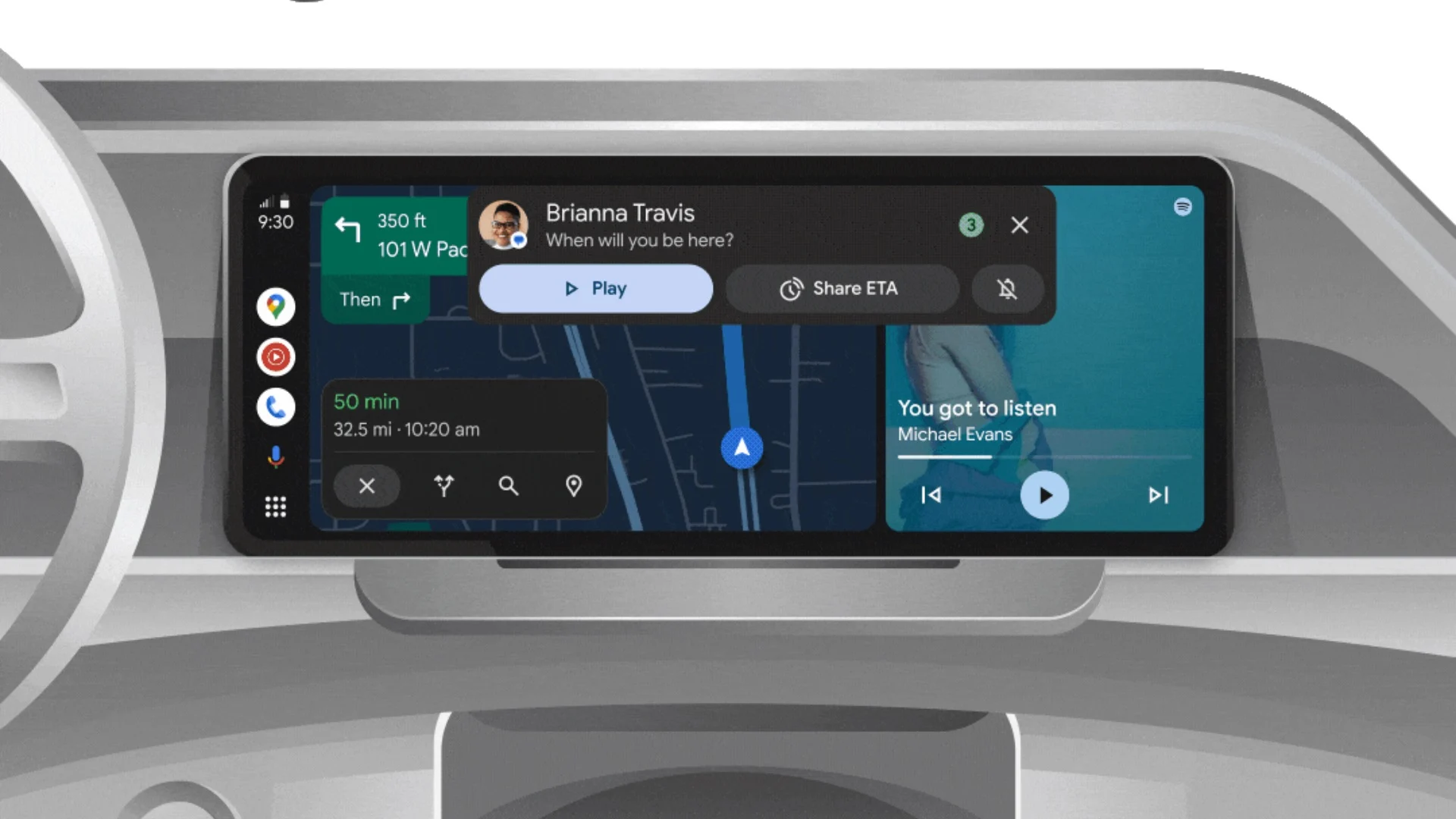
On another front, Android Automotive is improving how apps show information while you drive. Instead of opening full apps, you’ll see simple cards on your car’s screen that give you important details at a glance.
These cards help keep your focus on the road by showing things like music controls, navigation updates, or reminders without distractions. This new card system is designed to work smoothly with apps like media players and navigation tools, making your driving experience safer and more convenient.
Together, these updates show Google’s effort to make its apps smarter and easier to use in everyday life, whether you’re walking around with your smartwatch or driving your car. The focus is on clear, simple designs that help you get things done quickly without hassle.
In short, Google Keep’s new look on Wear OS and the smart cards in Android Automotive are small but useful changes that make tech fit better into your daily routine.
-
 Apps2 years ago
Gboard Proofread feature will support selected text
-

 Apps2 years ago
Google Contacts app testing new Besties Widget
-
 AI2 years ago
Google Pixel 9 Pro may come with a complimentary one-year Gemini Advanced subscription
-
 Apps2 years ago
Google Maps lets you report traffic jams and accidents on Apple CarPlay, but not on Android Auto
-
 Apps2 years ago
Google working on a new video editing feature for its Photo app
-

 Apps2 years ago
Google Messages app will transform MMS chats into RCS
-
 News2 years ago
Samsung USA crafting One UI 6.1.1
-
 AI2 years ago
Gemini now answers questions on your locked Android phone