
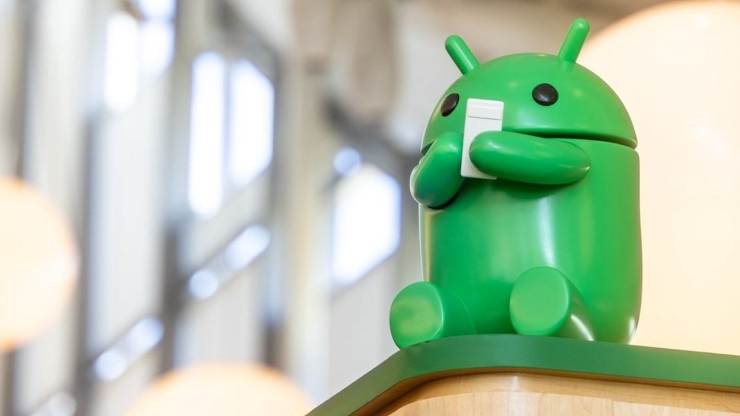
Android
Android 16: A fresh look at volume controls, navigation, and Google Photos
The Android ecosystem is constantly evolving, and the upcoming Android 16 release promises to refine the user experience. From subtle UI tweaks to more significant functional changes, Google seems focused on enhancing usability and streamlining core features. Let’s delve into some of the anticipated changes, including a potential volume panel redesign, enhancements to navigation, and a simplification of the Google Photos interface.
A Potential Volume Control Overhaul
One more noticeable change explored in Android 16 is a potential redesign of the volume controls. While Android 15 introduced a collapsible volume panel with distinctive pill-shaped sliders, early glimpses into Android 16 suggest a shift towards a more minimalist aesthetic.
Instead of the thick, rounded sliders of the previous iteration, Android 16 may feature thinner, continuous sliders with simple handles. This design aligns more closely with Google’s Material Design 3 guidelines, emphasizing clean lines and a less cluttered interface.
While some users may prefer the more pronounced sliders of Android 15, the new design offers a more precise visual representation of the volume level. The volume slider itself is also transforming, becoming less rounded with a thin rectangular handle. The icon indicating the active volume stream has been repositioned to the bottom of the slider, and the three dots that open the full volume panel have been subtly reduced in size. The volume mode selector has also been refined, displaying different modes within distinct rounded rectangles.
It’s important to remember that these changes are still under development. Google may choose to refine or even abandon this design before the final release of Android 16. However, it offers an intriguing look into Google is direction for its volume controls.
Predictive Back Comes to Three-Button Navigation
Navigating within Android apps can sometimes be a frustrating experience, especially when the back button doesn’t behave as expected. To address this, Google introduced “predictive back,” a feature that provides a preview of where the back gesture will lead. Initially designed for gesture navigation, this feature is now poised to expand to the more traditional three-button navigation system in Android 16.
Predictive back aims to eliminate the guesswork from navigation by showing a preview of the destination screen before the back action is completed. This prevents accidental app exits and ensures a smoother user experience. While predictive back has been available for gesture navigation for some time, its integration with three-button navigation marks a significant step towards unifying the navigation experience across different input methods.
Early tests show that pressing and holding the back button in three-button navigation reveals a preview of the next screen. This functionality even extends to apps that already support predictive back, such as Google Calendar. While some minor refinements are still expected, such as a preview of the home screen when navigating back from an app, the overall functionality is promising.
This addition is particularly welcome for users who prefer the simplicity and speed of three-button navigation. By bringing predictive back to this navigation method, Google is ensuring that all users can benefit from this improved navigation experience.
Streamlining Google Photos
Google Photos is also undergoing a simplification process, with a key change affecting the app’s bottom navigation bar. The “Memories” tab is being removed, consolidating the interface and focusing on core functionalities.
Instead of a four-tab layout, Google Photos will now feature a cleaner three-tab bottom bar: Photos, Collections, and Search (or the Gemini-powered “Ask” feature). This change streamlines navigation and declutters the interface, making it easier to access core features. The “Memories” functionality itself isn’t being removed entirely; it’s being rebranded as “Moments” and relocated to the Collections tab. This “Moments” section organizes photos from the same event, offering a convenient way to revisit past experiences.
This change reflects a trend towards simpler and more intuitive user interfaces. By reducing the number of tabs and consolidating related features, Google is aiming to make Google Photos more accessible and user-friendly.
Looking Ahead
These changes represent just a glimpse of what’s in store for Android 16. From UI refinements to functional enhancements, Google is clearly focused on improving the overall user experience. The potential redesign of the volume controls, the expansion of predictive back to three-button navigation, and the simplification of Google Photos all contribute to a more polished and intuitive Android ecosystem. As Android 16 continues to develop, we can expect further refinements and potentially even more significant changes. The future of Android looks bright, with a focus on usability, efficiency, and a seamless user experience.


Android Auto is a helpful tool that lets you use your phone’s apps safely while driving. It connects your phone to your car’s screen, making it easier to use maps, music, and calls. One of the features many people like is the ability to change how Android Auto looks by switching between light and dark themes.
How to switch between light and dark themes
Android Auto offers two main themes: light and dark. The light theme uses brighter colors, which can make the screen easier to see during the day. The dark theme uses darker colors, which can be more comfortable for your eyes at night or in low light.
To change the theme, follow these steps:
- Open the Android Auto app on your phone.
- Go to the settings menu.
- Find the “Theme” option.
- Choose between “Light,” “Dark,” or “Set by car” (this lets your car decide the theme based on the time of day or your car’s settings).
Why themes matter
Using the right theme can make driving safer and more comfortable. The light theme is good for bright days, while the dark theme helps reduce glare at night. Having these options means you can pick what works best for you, making Android Auto easier to use in any condition.
In short, Android Auto’s theme options are simple to use and help you drive more safely by making the screen easy to see, no matter the time of day.

Google has just rolled out some exciting updates across its services and apps. Here’s a simple breakdown of what’s new and what it means for you.
Gemini 2.5 Pro is here
Google has launched Gemini 2.5 Pro, the latest version of its AI model. This upgrade brings smarter and faster responses, making it easier for users to get helpful answers. Gemini 2.5 Pro is now available in Google’s AI Studio and Vertex AI, so developers can build even better tools and apps using this technology.
Android 16 brings more customization
Android 16 is adding new ways to personalize your phone. One of the standout features is the ability to hide the clock on your lock screen, giving you a cleaner look if you want it. This is part of Google’s push to let users make their phones feel more unique. There’s also a new animation for the power button, making the experience smoother and more modern when you turn your phone on or off.
Google Messages removes the unsubscribe button
If you use Google Messages, you might notice that the “Unsubscribe” button is gone from some business messages. Google has removed this feature, so users now have to find other ways to stop unwanted texts. This change might make it a bit harder to manage spam, but Google hasn’t said why the option was removed.
What does this mean for you
These updates show that Google is focused on making its products smarter and more personal. Whether you’re using AI tools, customizing your phone, or managing your messages, you’ll see some changes that aim to improve your experience.
Google Keep is getting a fresh look with the new Material You design, making it more colorful and easier to use on Wear OS smartwatches. The update brings bigger buttons and clearer text, so you can quickly jot down notes or check your lists right from your wrist. This makes Google Keep more handy when you’re on the go and don’t want to pull out your phone.
On another front, Android Automotive is improving how apps show information while you drive. Instead of opening full apps, you’ll see simple cards on your car’s screen that give you important details at a glance.
These cards help keep your focus on the road by showing things like music controls, navigation updates, or reminders without distractions. This new card system is designed to work smoothly with apps like media players and navigation tools, making your driving experience safer and more convenient.
Together, these updates show Google’s effort to make its apps smarter and easier to use in everyday life, whether you’re walking around with your smartwatch or driving your car. The focus is on clear, simple designs that help you get things done quickly without hassle.
In short, Google Keep’s new look on Wear OS and the smart cards in Android Automotive are small but useful changes that make tech fit better into your daily routine.
-

 Apps1 year ago
Gboard Proofread feature will support selected text
-

 News1 year ago
Samsung USA crafting One UI 6.1.1
-

 Apps12 months ago
Google Contacts app testing new Besties Widget
-
 AI12 months ago
Google Pixel 9 Pro may come with a complimentary one-year Gemini Advanced subscription
-
News1 year ago
Breaking: Samsung Galaxy S22 may get Galaxy AI features
-
 Apps12 months ago
Google working on a new video editing feature for its Photo app
-

 Apps12 months ago
Google Maps lets you report traffic jams and accidents on Apple CarPlay, but not on Android Auto
-

 Apps12 months ago
Google Messages app will transform MMS chats into RCS