
A Fresh Look for Google Messages: Subtle animations breathe new life into conversations
In the ever-evolving world of mobile communication, staying fresh and engaging is paramount. Google Messages, already a powerful platform connecting millions, appears to be taking this to heart with the introduction of subtle yet impactful animations. These aren’t flashy gimmicks, but rather carefully crafted visual cues that enhance the user experience and inject a sense of polish into everyday interactions.
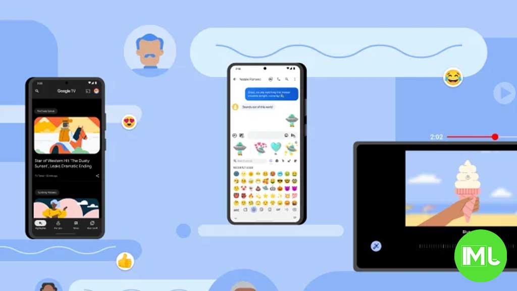
For years, text messaging has been a relatively static experience. Messages appear, they stack, and they remain. While functional, this approach lacks the dynamism that modern users have come to expect. Google seems poised to change this, introducing a new animation system for both sending and receiving messages that adds a touch of visual flair without being distracting.
Imagine this: you tap send on a message to a friend. Instead of simply appearing in the chat window, the message begins small and gracefully expands to its full size, almost as if it’s blossoming onto the screen. The same elegant animation occurs when you receive a message, creating a smooth and cohesive visual flow. It’s a small detail, but these are the kinds of details that elevate a good app to a great one.
This new animation is not just a cosmetic change; it speaks to a broader trend in app design. As apps mature and move beyond basic functionality, the focus shifts to user experience. Small touches like these animations demonstrate attention to detail and a commitment to creating a more enjoyable and engaging environment. They signal that an app has moved beyond simply working and is now focused on delighting its users.
The beauty of this new feature lies in its subtlety. It’s not an over-the-top effect that draws attention away from the conversation itself. Instead, it’s a gentle enhancement that adds a layer of refinement to the overall experience. It’s the difference between a functional room and a thoughtfully decorated space – both serve their purpose, but one is clearly more inviting and enjoyable to be in.
The impact of these animations is twofold. Firstly, they provide immediate visual feedback to the user, confirming that their message has been sent or received. This subtle confirmation can contribute to a more seamless and reassuring experience. Secondly, they add a touch of personality to the app. In a world of increasingly homogenous interfaces, these small visual flourishes can help an app stand out and create a more memorable impression.
This isn’t about adding unnecessary bells and whistles. It’s about recognizing that even small visual cues can have a significant impact on how users perceive and interact with an app. It’s about creating a more fluid, engaging, and ultimately more human experience.
While this feature isn’t widely available just yet, its emergence hints at Google’s ongoing commitment to refining and improving Google Messages. It’s a sign that the platform is not just resting on its laurels but is actively seeking ways to enhance the user experience and keep pace with the evolving demands of modern communication. It’s a reminder that even in the world of text messages, there’s always room for a little bit of magic.


Google Meet is getting a big update to its look, thanks to the new Material 3 design. This change brings a cleaner and more modern style to the video calling app, making it easier and more enjoyable to use.
With Material 3, Google Meet now has rounder buttons, softer colors, and better spacing between elements. The main controls, like the microphone, camera, and end call buttons, are now larger and easier to tap. The icons and text are also clearer, which helps users find what they need quickly during a call.
Another improvement is the new “expressive” color system. This feature lets the app’s colors match your device’s wallpaper or theme, giving each user a unique and personalized experience. The changes also make Google Meet more accessible, as the new design is easier to read and use for everyone, including people with vision difficulties.
These updates are rolling out to both web and mobile versions of Google Meet. Google says the new look will help people feel more comfortable and focused during their meetings. Overall, the Material 3 update makes Google Meet not only look better but also work better for all its users.

Android Auto is a helpful tool that lets you use your phone’s apps safely while driving. It connects your phone to your car’s screen, making it easier to use maps, music, and calls. One of the features many people like is the ability to change how Android Auto looks by switching between light and dark themes.
How to switch between light and dark themes
Android Auto offers two main themes: light and dark. The light theme uses brighter colors, which can make the screen easier to see during the day. The dark theme uses darker colors, which can be more comfortable for your eyes at night or in low light.
To change the theme, follow these steps:
- Open the Android Auto app on your phone.
- Go to the settings menu.
- Find the “Theme” option.
- Choose between “Light,” “Dark,” or “Set by car” (this lets your car decide the theme based on the time of day or your car’s settings).
Why themes matter
Using the right theme can make driving safer and more comfortable. The light theme is good for bright days, while the dark theme helps reduce glare at night. Having these options means you can pick what works best for you, making Android Auto easier to use in any condition.
In short, Android Auto’s theme options are simple to use and help you drive more safely by making the screen easy to see, no matter the time of day.

Google is rolling out some helpful updates to two of its popular apps: Google Drive and Files by Google. These changes are designed to make managing your files and watching videos much smoother.
First, Google Drive is getting a new video player. Now, when you upload a video to Drive and open it, you’ll notice a fresh look that matches Google’s latest design style. The controls, like play and pause, are easier to use and look cleaner. This update makes it simpler to watch videos directly in Drive without needing to download them first.
Meanwhile, the Files by Google app is also getting a makeover. The app is adopting Google’s Material 3 design, which means it looks brighter and more modern. The buttons and menus are easier to see and use, making it simpler to find, move, and organize your files. There are also new color options and improved icons, so everything feels more user-friendly.
Both updates show Google’s commitment to making its apps more helpful and enjoyable to use. Whether you’re watching videos in Drive or sorting files on your phone, these changes aim to save you time and make things less complicated. If you use these apps, keep an eye out for these new features—they should arrive soon!
-

 Apps2 years ago
Gboard Proofread feature will support selected text
-

 Apps2 years ago
Google Contacts app testing new Besties Widget
-
 AI2 years ago
Google Pixel 9 Pro may come with a complimentary one-year Gemini Advanced subscription
-

 Apps2 years ago
Google Maps lets you report traffic jams and accidents on Apple CarPlay, but not on Android Auto
-
 Apps2 years ago
Google working on a new video editing feature for its Photo app
-

 Apps2 years ago
Google Messages app will transform MMS chats into RCS
-

 News2 years ago
Samsung USA crafting One UI 6.1.1
-
 AI2 years ago
Gemini now answers questions on your locked Android phone