News
Circle to Search: Galaxy S24’s most popular AI feature you didn’t know was made by Google

Samsung revealed Circle to Search is the most popular AI feature of the Galaxy S24 series. While Galaxy AI is loaded with many tools derived from artificial intelligence and GenAI, Google’s AI magic is popular among Galaxy users.
According to Samsung (really!), Circle to Search is the most popular feature among Galaxy S24 users, which Google made. The list of popular features also includes a handful of Galaxy AI features, but Circle to Search is on top.
Samsung’s press release reads:
- Circle to Search with Google revolutionized the way users search, helping it become the most widely used AI feature amongst Galaxy S24 users. It allows them to learn more about almost anything on their screens quickly with a simple gesture, without having to switch apps.
Circle to Search feature made its official debut at the Galaxy Unpacked earlier this year. Samsung revealed Google has exclusively developed this feature for the best Android phones, available only on Galaxy and Pixel phones.
Recently, Google’s CEO announced that Circle to Search is expanding to Pixel 6, 6a, 6 Pro, 7a, Fold and Tablet devices. Samsung is also bringing it to the Galaxy S23 series, Z Flip 5, Z Fold 5, and Tab S9 series with One UI 6.1.

Image: Google
Stay up-to-date on Google Pixel, Android & Tech Stuffs by following I M Judge on X/Twitter where you can also discover the latest news, polls, reviews, and new features for Google Apps, Pixel Phones, and the Android operating system.
Do you like this post? Kindly, let us know on X/Twitter: we love hearing your feedback! If you prefer using other social platforms besides X, do follow/join us on Facebook and Telegram.
News
Android 15 Volume Panel UI Design Is Close to Perfection
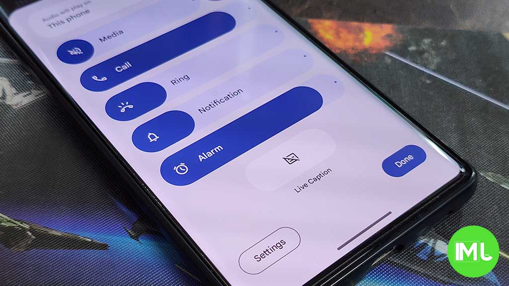
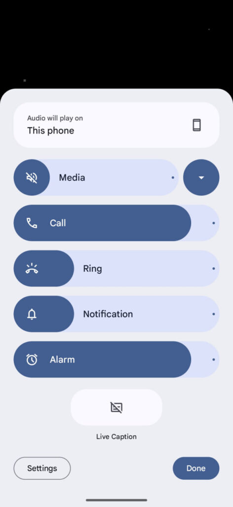
Android 15 Beta 2 introduced a redesigned volume panel UI on Pixel devices. Google made radical changes to the user interface of volume settings in stock Android. The elemental changes and rearrangement render the functionality close to perfection.
Volume Panel in Android 15 Beta 2 looks so fresh on Pixel devices. The old thin-line sliders have been replaced with thicker ones. The panel now occupies a large portion of the screen, offering ease of access and seamless adjustment across functions.
Tapping any of the volume buttons opens the quick adjustment bar, which is now slightly larger in height. When extended, the redesigned page appears with settings to select the audio output channel, followed by volume levels for Media, Call, Ring, Notification, and Alarm.
Compared to the new UI, the older one was easily accessible even single-handedly. Google should have aligned mostly used sliders like Media and Ring at the bottom so they can be reached with the thumb. Toggles like Live Caption, Settings, and Done are aligned at the bottom.
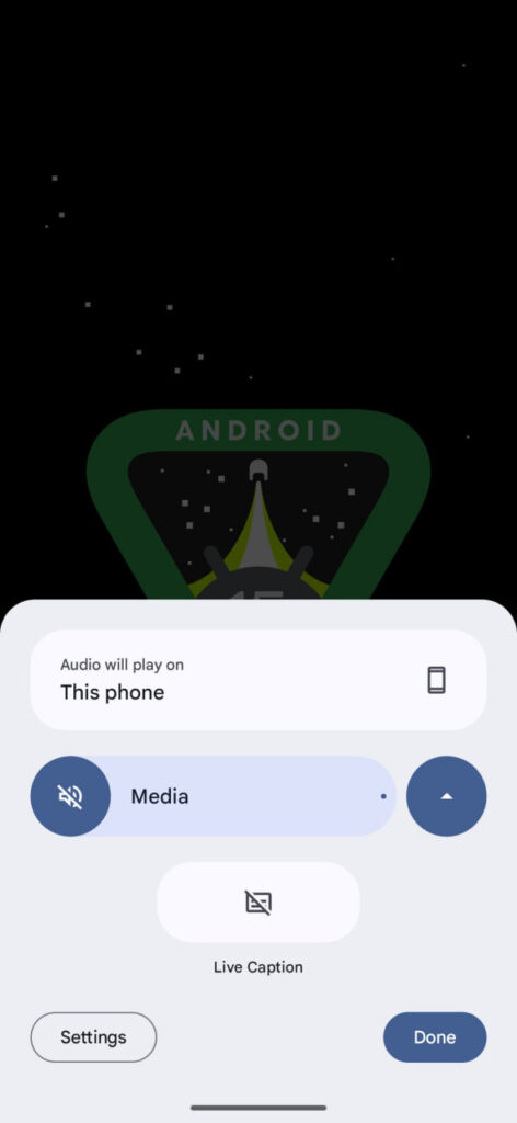
Next to the Media volume slider, there’s a toggle to minimize the volume panel UI. When tapped, only the Media volume adjustment slider remains visible in half of the entire page’s space. Footer toggles and Audio output header remain the same as the extended view.
Google redesigned Pixel’s volume panel as part of introducing some visible changes in Android 15. As far as usability is concerned, the company should hear the feedback and make arrangements for easier reach. Panel opens extended by default is also a concern, which should be reworked.
Google will release Android 15 later this year. Pixel devices have started getting the second beta of the new operating system. If you own one, you can sign up for the Beta Program through the official Android website. If you don’t want to face bugs and issues, wait till the Stable release.
Stay up-to-date on Google Pixel, Android & Tech Stuffs by following I M Judge on X/Twitter where you can also discover the latest news, polls, reviews, and new features for Google Apps, Pixel Phones, and the Android operating system.
Do you like this post? Kindly, let us know on X/Twitter: we love hearing your feedback! If you prefer using other social platforms besides X, do follow/join us on Facebook and Telegram.
News
Google CEO Pichai warns OpenAI over potential copyright infringement in AI training
Google’s Gemini is going great and in the I/O 2024, Google has already revealed some new interesting features for AI lovers. At the I/O 2024 conference, Google unveiled new AI models – Gemini 1.5 Pro, including Veo (currently limited and requires Google’s approval), capable of generating synthetic videos.
Just a day before, OpenAI, a Microsoft-backed AI company, also revealed its GPT-4o model. This model allows for realistic voice conversations within their ChatGPT mobile app. Both companies showcased similar upcoming features, highlighting the rapid advancements in AI technology.
During an interview with CNBC, Google CEO Sundar Pichai addressed concerns about OpenAI, potentially using YouTube content to train their video-generating AI model – Sora.
This follows uncertainty from OpenAI’s technology chief regarding YouTube data being used for training the “Sora” model. Some reports suggest OpenAI might have transcribed a massive amount of YouTube content. Several others have also accused OpenAI of using copyrighted materials like news articles to train the AI models.
“Look, I think it’s a question for them to answer,” Pichai said. “I don’t have anything to add. We do have clear terms of service. And so, you know, I think normally in these things we engage with companies and make sure they understand our terms of service. And we’ll sort it out.”
There have been rumors about Apple potentially adding Gemini to iPhones, but it’s not confirmed yet. We could see something in June 2024 at the Apple Worldwide Developers Conference. Google and Apple have a history of successful partnerships, despite being major competitors in the same industry. A legal case in November 2023 revealed that Google shared 36% of its search advertising revenue generated through Apple’s Safari browser with Apple.
“We have focused on delivering great experiences for the Apple ecosystem,” Pichai said. “It is something we take very seriously and I’m confident — we have many ways to make sure our products are accessible. We see that today, AI Overviews have been a popular feature on iOS when we have tested, and so we’ll continue — including Gemini. We’ll continue working to bring that there.”

News
HarmonyOS NEXT will free Huawei phones from Android, EMUI globally
Following the US restrictions, Huawei gradually grew its own operating system named HarmonyOS. Since its launch years ago, HarmonyOS has been limited to China. Huawei is seemingly in the final phase of replacing Android/EMUI with HarmonyOS Next globally.
Huawei hasn’t left graphical signs of Android, but EMUI is still based on Google’s OS. The Chinese vendor hasn’t adopted a newer version of Android due to restrictions. Meanwhile, it regularly bumped EMUI versions along with user interface changes and new features.
HarmonyOS Next is preparing to replace EMUI in the global market. A broad applications ecosystem is reportedly under preparation, paving the way for Huawei to completely ditch Android. Huawei has not confirmed anything just yet, this is based on a report by Nikkei Asia.
The company is planning to include HarmonyOS Next exclusively, instead of Android. It is expected to come pre-installed on the Huawei Mate 70 series later this year. It could come with support for 4,000 apps, though that will grow to 5,000 within a year.

Image: Huawei Central
Huawei’s HarmonyOS Next is said to be 3x more memory efficient than the latest HarmonyOS iteration. As the era of artificial intelligence and Generative AI is booming, the HarmonyOS Next won’t also lag behind in that aspect as it’s slated to support on-device AI.
HarmonyOS is growing rapidly in the Chinese territory, with smartwatches available in Europe too. Android and iOS are the most widely used mobile operating system. However, the arrival of a new and mature challenger would make the competition fierce in the industry.
Stay up-to-date on Google Pixel, Android & Tech Stuffs by following I M Judge on X/Twitter where you can also discover the latest news, polls, reviews, and new features for Google Apps, Pixel Phones, and the Android operating system.
Do you like this post? Kindly, let us know on X/Twitter: we love hearing your feedback! If you prefer using other social platforms besides X, do follow/join us on Facebook and Telegram.
-

 News3 months ago
Samsung USA crafting One UI 6.1.1
-
 News2 months ago
Samsung Galaxy S23 Ultra with One UI 6.1 and all S24 AI features revealed
-

 News2 months ago
Breaking: Samsung Galaxy S22 may get Galaxy AI features
-

 News3 months ago
One UI 6.1 Auracast (Bluetooth LE Audio) feature coming to many Samsung phones
-
 Apps3 months ago
Samsung Expert RAW gets March 2024 update
-
 News3 months ago
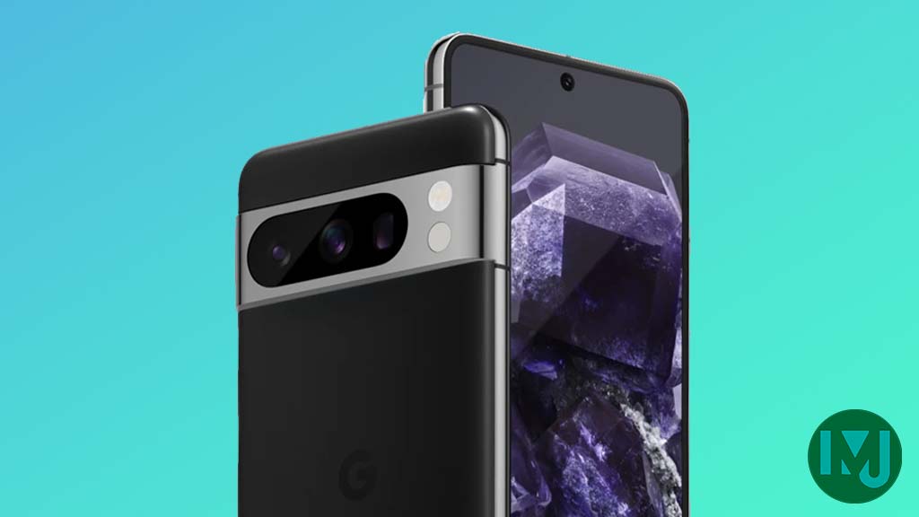
Google Pixel evolves as Europe’s third best selling flagship
-

 Watch3 months ago
Next Wear OS Samsung Watch will pack Galaxy AI features
-
 News3 months ago
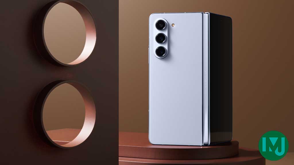
Samsung faces heat as Huawei rises in growing foldable market

